First, I want to say that we are viewing Navionics charts on iNavX on our iPad. I don’t know for certain whether the issues are with Navionics charts or with the software we are using to view them.
Problem #1: In some areas that we’ve visited that have not been hydrographically surveyed Navionics has depths marked. This sounds like a great thing, right? I assume (but can’t confirm) that Navionics is using satellite imagery to mark obvious shallow areas in those non-surveyed areas. I love the idea that they are using the satellite imagery to enhance their charts – this is fantastic – but what is odd to me is that in some of those places they have assigned a depth of 5m (16 feet) to all of those shallow spots.
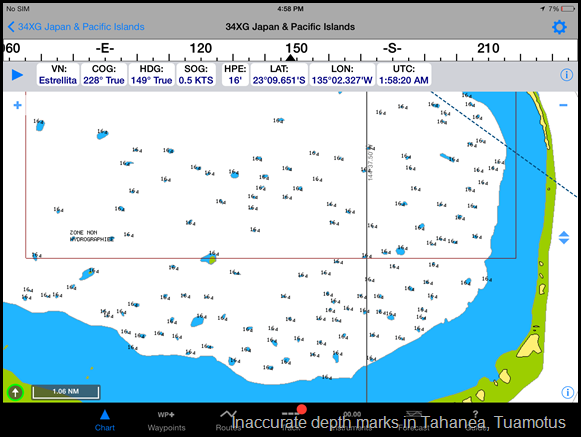
Take this view of SE Tahanea in the Tuamotus – one of our favorite places. You can see that all of the blue dots are marked 16 feet. Having spear fished and snorkeled a number of those blue dots close to the anchorage and having sailed very close to some of the others, I can say with absolute certainty that many of those dots are shallower than 16 feet – in fact, some are at the surface. Why assign an arbitrary and unverified depth and worse, why assign a depth that is a safe depth for most cruising boats to transit over? I hope no one is naïve enough to sail blithely over these 16 foot marks in bad visibility, but still, the charts become actively misleading when they present specific (but inaccurate) depths.
Problem #2: The shallowest depth is not the depth that shows on the chart when zoomed out. The depth when zoomed out is the depth of the outer ring of a shallow spot (the deepest) rather than the inner ring (the shallowest).
Here is an example of three shallow spots from Taravai in Mangareva, Gambiers showing that at a fairly normal level of zoom, they are all marked at 32 feet.
At a closer level of zoom, one shallow is now shown at 19 feet and one now at 16. The third remains at 32 feet.
At an even closer level of zoom, the third shallow reveals a 26 foot depth.
Obviously in this example, we could sail over all three (if we trusted the charted depths) but in others we have found shallower marks hidden.
On a positive, several countries past French Polynesia we are still finding the Navionics charts to be the most accurate. Of course, not always as this screenshot from Tonga shows us sailing right over a reef (track in yellow dashes) which was in fact to port the entire time.


No comments:
Post a Comment